Thursday 29 November 2012
Narrative: Little Boy Fully Skinned
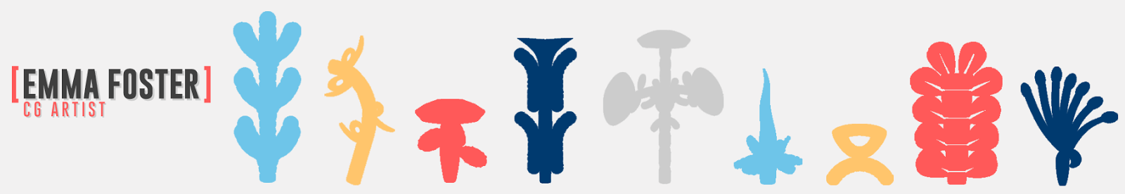
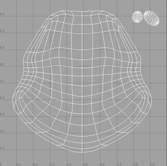
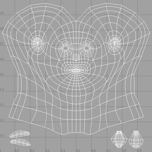
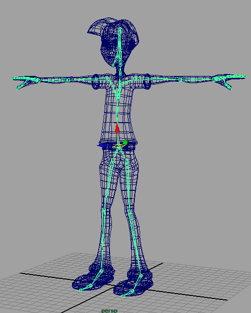
The little boy character for my group project is now fully skinned and ready to next be rigged. Here are two videos of animation of the skinning, one plain and one with the UV mapping and eyes visible.
Wednesday 28 November 2012
Narrative: Little Boy UV Mapped
The main character for my group project animation is now ready to be textured by Alice and skinned and rigged by myself :)

Hair UV Map
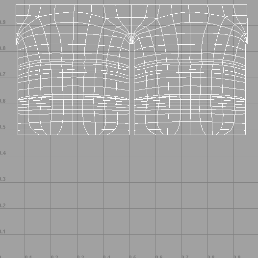
Head, Throat, Eyebrows UV Maps
Shirt/Arms and Hands UV Maps
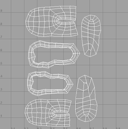
Shoes UV Maps
Legs/Trousers UV Maps
Tuesday 27 November 2012
Research: James Bond 'You Only Live Twice'
As part of developing my character design into a more 1960s orientated world and making myself live and breathe the 1960s for the rest of the unit last week I watched the 1967 James Bond film 'You Only Live Twice'.
I paid close attention to the stylisation of the sets, costumes and props including the cars and here are just some of the things that particularly caught my eye as good inspiration for my work.


I paid close attention to the stylisation of the sets, costumes and props including the cars and here are just some of the things that particularly caught my eye as good inspiration for my work.
Set Designs
Costume
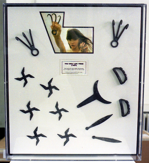
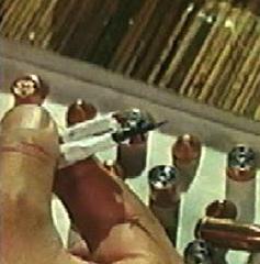
Props- I particularly liked the clever gadgets of the lipstick smoke spray and the cigarette dart. Especially the dart as the cigarettes are nearly forgotten about and only come in useful at one of the worst times for Bond in the film.
Character Design: Week 8 Exercises
This week in our character design lesson Justin spoke the words 'role play' and immediately my head screamed uh oh! thinking we were going to do some acting. But it actually turned out that we were to pretend that we were a group of designers producing character designs for a client which my head much preferred. :)
We were given a sort of brief of characters under the title 'Jetpack Jones' set in the 1940s and we were to do at least two each, even if it ended up with duplicates. I worked alongside Sammy and Lydia, and a bit with Anita until she got changed to form an extra group.
We started by asking ourselves what would make the characters scream 1940s and thought of a sort of Art Deco style to develop from.
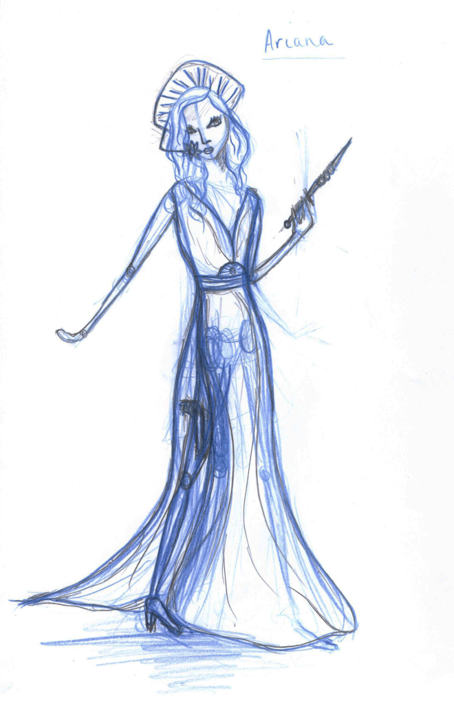
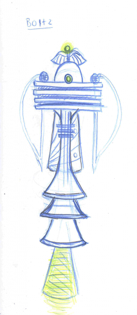
I ended up creating designs for Ariana, the beautiful space princess and Boltz, Jetpack Jones' trust medical droid sidekick.
We were given a sort of brief of characters under the title 'Jetpack Jones' set in the 1940s and we were to do at least two each, even if it ended up with duplicates. I worked alongside Sammy and Lydia, and a bit with Anita until she got changed to form an extra group.
We started by asking ourselves what would make the characters scream 1940s and thought of a sort of Art Deco style to develop from.
I ended up creating designs for Ariana, the beautiful space princess and Boltz, Jetpack Jones' trust medical droid sidekick.
I took a lot of inspiration from the Art Deco movement looking at the art deco lady posters that are popular. I also looked at art deco patterns for accents such as Arianna's head dress, waist buckle and communication device and then looked at 1940s Hollywood actresses for a glamorous feel. Star Wars' Princess Leia was also referred to for her space princess role.
Half way through the lesson Justin changed a quality of Ariana saying that she had a water environment background so I made her accents more shell like. As the client Justin was very happy with this design.
For Boltz I looked at 1940s machines and Art Deco structures. Because of his role of scanning for medical problems I decided that being able to hover would be suitable. Justin really liked the shapes and style of him however, when it came to conveying Boltz 'odd' behaviour after an accident he was too symmetrical.
More Sidekick Sketches
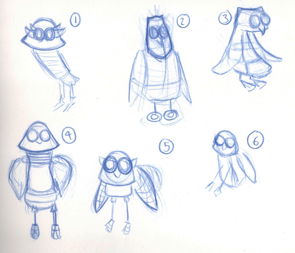
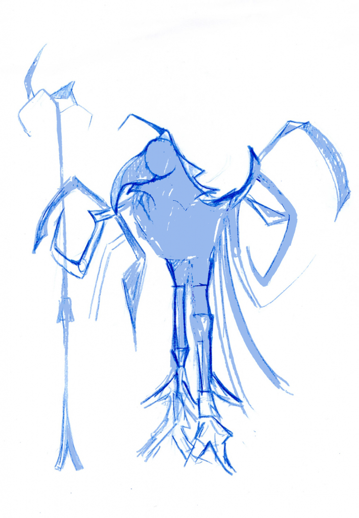
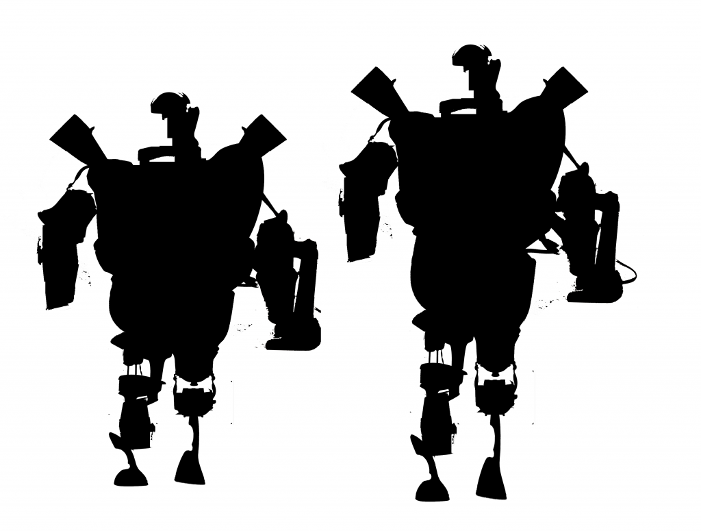
As I changed my theme to the 1960s I went back to my sidekick designs and tried to adapt them to match up with my heroine and the era. #1 is a very similar version to a previous sketch but I have adjusted the shapes a little to make them more 1960s. I still don't think its there quite yet and honestly am leaning more to #1 than any of the others so I think I somehow need to find a way to develop that one which will keep it robot and owl like but also 1960s and sci-fi because right now it just doesn't seem right.
Monday 26 November 2012
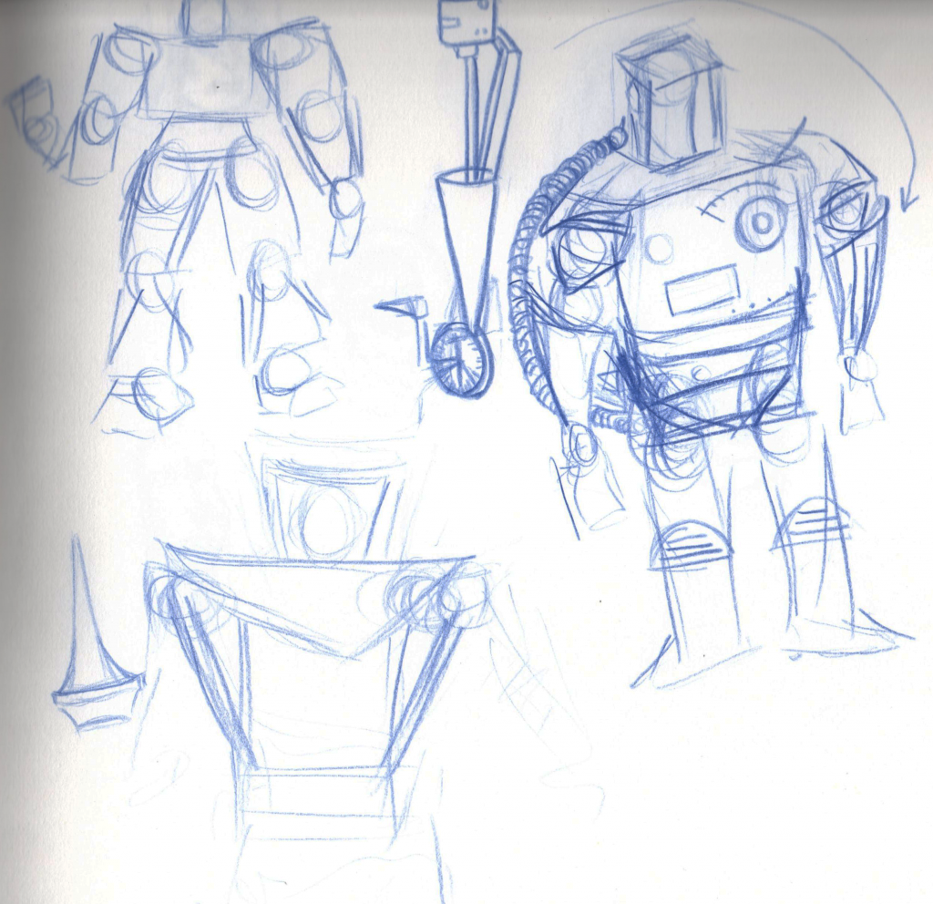
Character Design: Development of Villain
To develop my villain I took my existing silhouette and started working into it keeping in mind the markings and shapes on 1960s appliances. I also used my research into 1960s spacesuits to make sure the outerspace feel was in the design. I've just gotta develop his face a bit more and pop him inside the helmet now to complete it and see if it all fits together well enough.
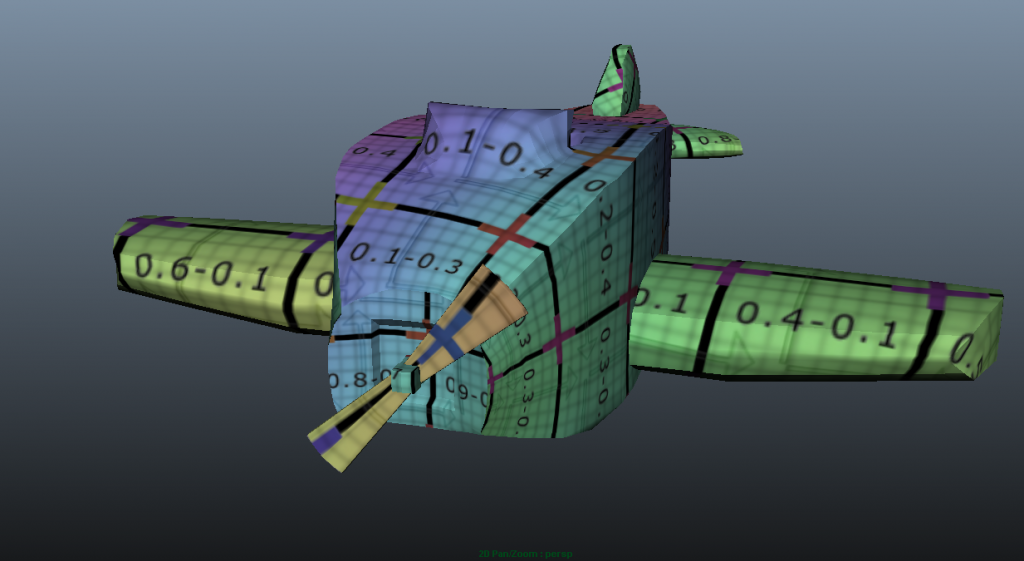
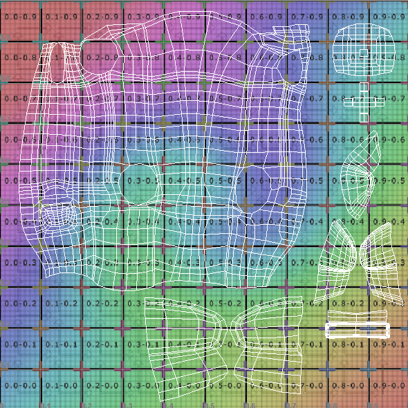
UV Mapped Plane
Over at Pigment Studios we now have a fully modelled and uv mapped plane, ready for a texture job. This prop is vital to our animation's message so it's great to have this ticked off the to do list :)
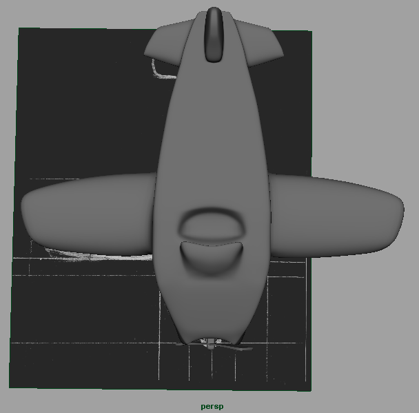
Wooden Plane Model
For my group project I was given the role of modelling the important wooden plane prop which is now complete. Here are a couple of images of the final result.


Sunday 25 November 2012
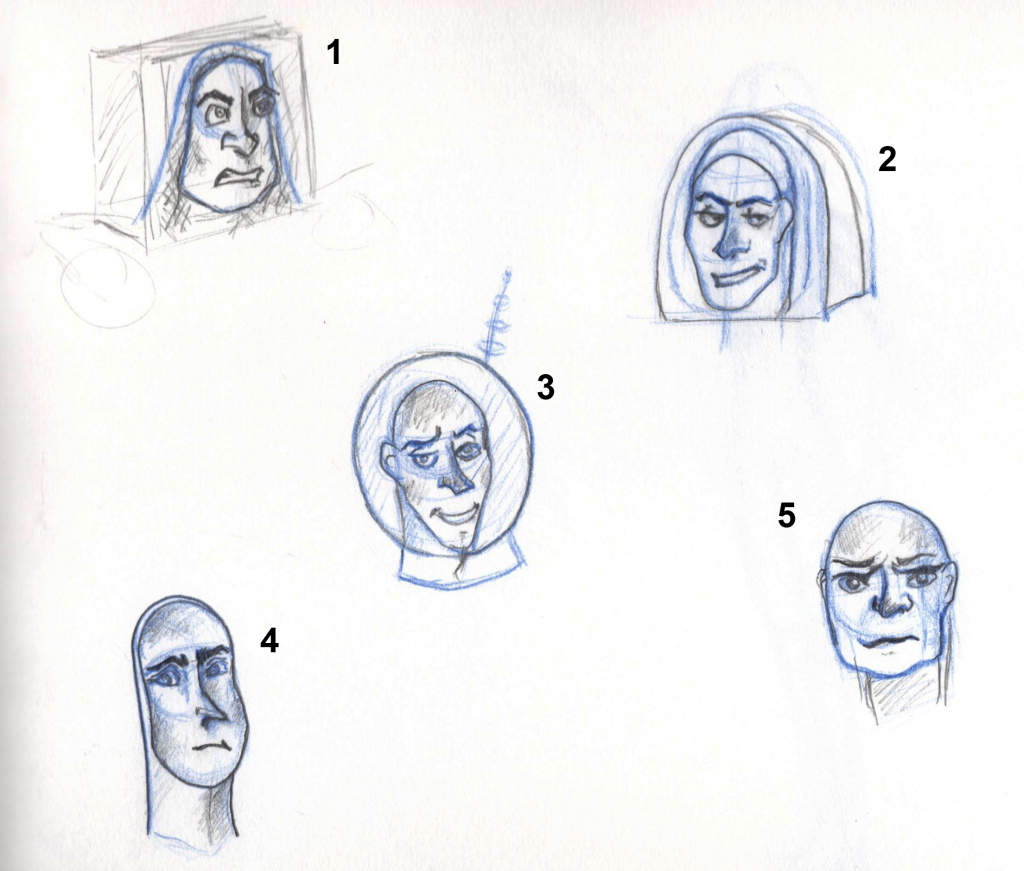
Character Design: Villain Faces
These are some experiments with possible faces for my villain I did a little while ago but didn't upload. #1 to me reminds me too much of Buzz Lightyear and #5 seems too old for the personality of my villain. I like the shape of #4 but in discussion with Justin he said it didn't scream space operatic villain! However, we both liked #2 because there is somewhat a sense of being vain about him so I will take him and develop him further to really make him reek evil space villain, definitely changing his helmet! :)
Previous Villain Shape Experimentation
Before I went on to create silhouettes for my villain I had been thinking about the type of shape I wanted him to be so I created a few variations to see which I thought would suit him best. I liked the idea of a really out of proportion body with a small head as the head was pretty much the only fully human part to be exposed because of the back story of his character so I went on to develop with that for my silhouettes.

Character Design: Week 7 Exercises
For this week's character design lesson we looked at how the animal build and anatomy still relates back to human anatomy but just in slightly different places. We took animal reference books and had to find the parts of human anatomy within the animals and draw them using them, so finding where the knee was, then the ankle and toe joints.
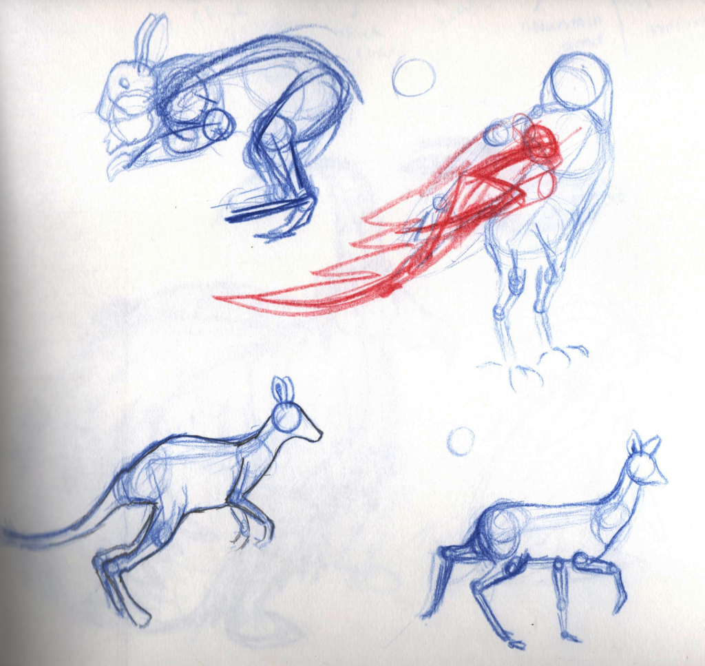

We then were given a type of environment and had to design an animal which was adapted to this environment using existing animals that lived there. I got 'mountainous' so I did a bit of research into this before starting but I ended up with a mountain goat, yaklike thick coat feathered creature. I thought it needed to keep warm, be able to travel to find food and easily navigate the mountainous terrain without problems.
Character Design: Week 6 Exercises
For our 6th week of character design lessons we looked at starting to produce silhouettes which had a lot of interest and a lot to see just from being silhouettes. We were asked to create a line up of monster silhouettes. I began struggling quite a bit with it because I found it hard to figure out where to start but I kept trying and on my last attempt Justin said that there was a lot more interest in it and the design matched up to the prop elements alongside it.

Friday 23 November 2012
Skinning Part 6: Head
I've now finished skinning the character from the tutorials and it went with only a couple of issues so fingers crossed this will translate when I skin the characters for my narrative project.
Skinning Part 5: Shoes
The shoes are now fully skinned with the problem of too much influence being at the wrong joints now sorted.
Skinning Part 4: Trousers
Just a clip of animation showing the result of skinning the trouser leg.
Thursday 22 November 2012
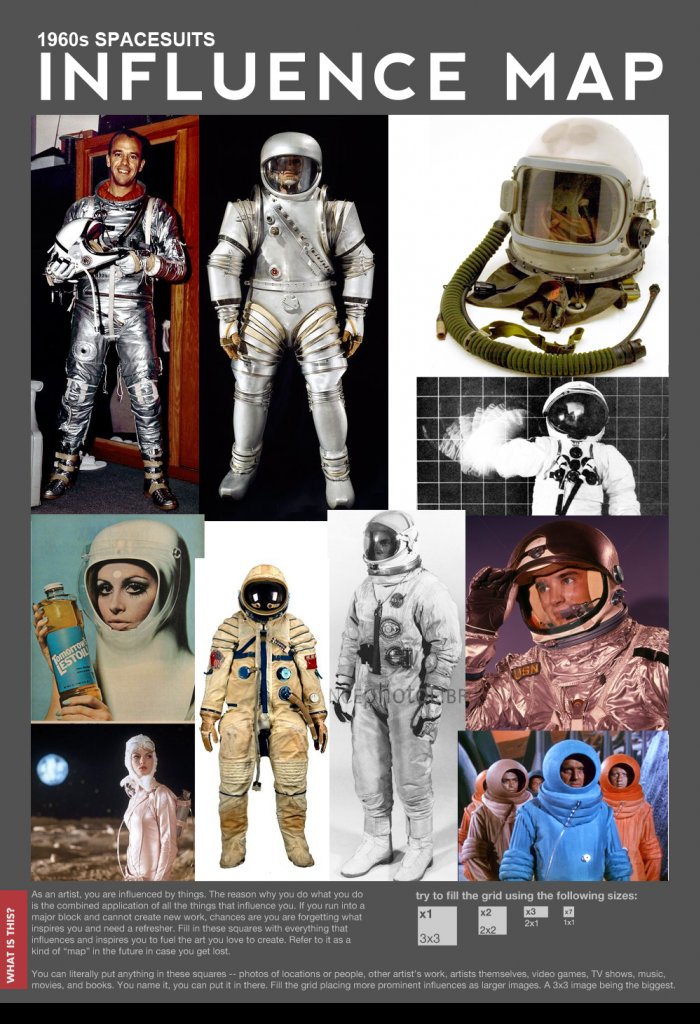
Character Design: 1960s Spacesuit Influence
Now that I'm really starting to piece together my villain I have been looking at examples of spacesuits during the 1960s as I need his outfit/armour to come across as space related as well as villainous and operatic. I especially made sure I looked at 1960s Russian spacesuits as Justin and I had been talking about their design a lot. So now I am going to try and apply the spacesuit asthetic to my villainous 1960s appliances being!
Skinning Part 3: Shirt & Hands
As part of skinning the shirt and hands better I added animation to the joints which I have playblasted below.
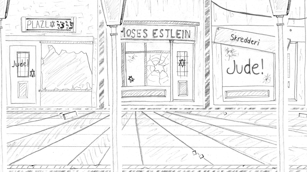
Night of the Broken Glass (Jewish Shops) Concept
Another environment I have created as part of my group collaboration over at Pigment Studios depicting our change in style and one of the key events of the Second World War.
Tuesday 20 November 2012
Skinning Part 2: Binding
Got the binding of the character complete. I think it is correct however, unlike in the tutorials the geometry didn't turn pink on the edges at some parts but I have double checked each part and everything seems to be binded correctly. Maybe this is because of the different Maya versions? Will soon find out!

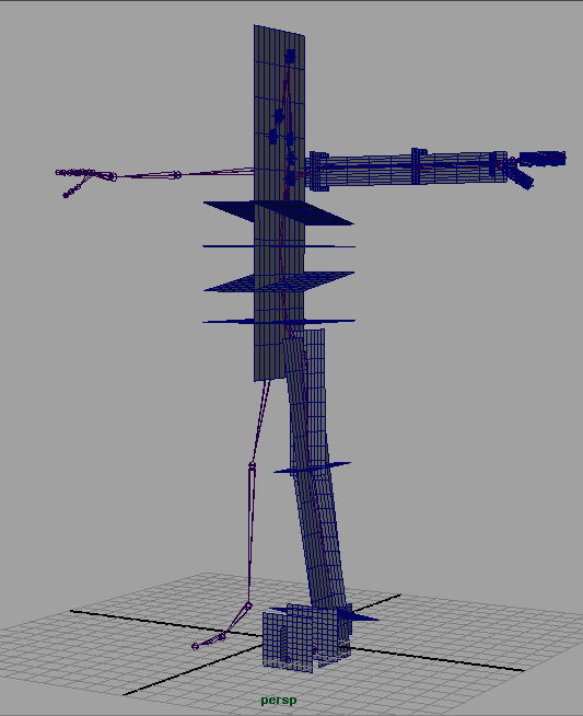
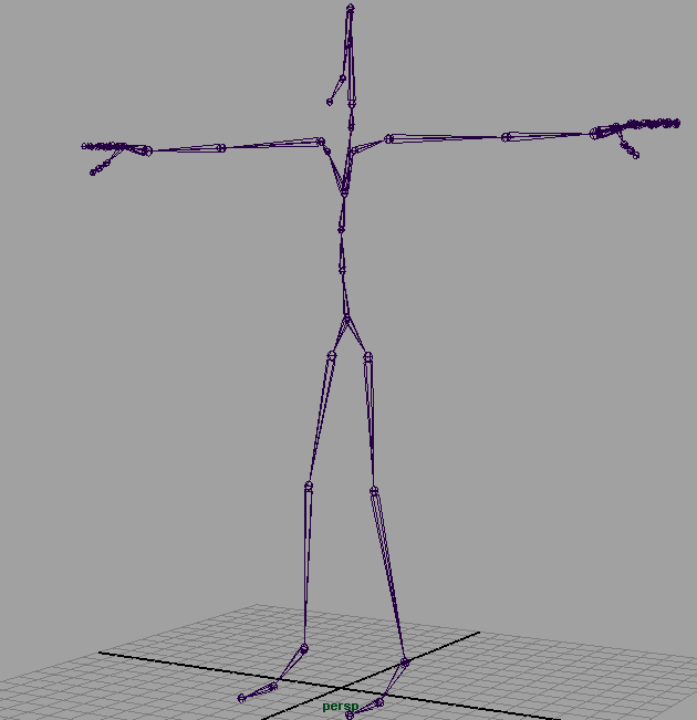
Skinning Part 1: Creating Joints
I've finally created the base skeleton for the skinning, this was great practise for me as I wasn't sure exactly where some of the joints would sit like in the face so hiding and showing the model layers as I laid the joints helped me figure out where they went as well as mapping out a rough grid for some areas.
Rough grid for laying joints.
Laid out joints.
Checking joint layout with model visible.
Character Design: Villain Silhouettes Inspired by 1960s Appliances
Because I had been struggling not only with my villain overall but also trying to get the 1960s into his unusual form I have taken some 1960s appliances and technology such as toasters, lamps, walkie talkies and kettles and fit them together to create a humanoid silhouette. I then shortened the bottom half of it to make it more like my original body shape sketch that I was after.
I think I'll be doing some more of these as they really helped me see the 1960s shapes more. Perhaps with car parts next time!
I think I'll be doing some more of these as they really helped me see the 1960s shapes more. Perhaps with car parts next time!
Monday 19 November 2012
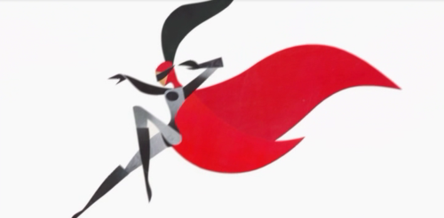
Character Design: Heroine Outfits
I have been working on possible outfits for my heroine secret agent. I have used my research into 1960s mod and space-age fashion to help me do this while trying to keep the sleek vibe of a secret agent but also add a sci-fi sense about her too.
For my first attempts I'm pretty happy with them.
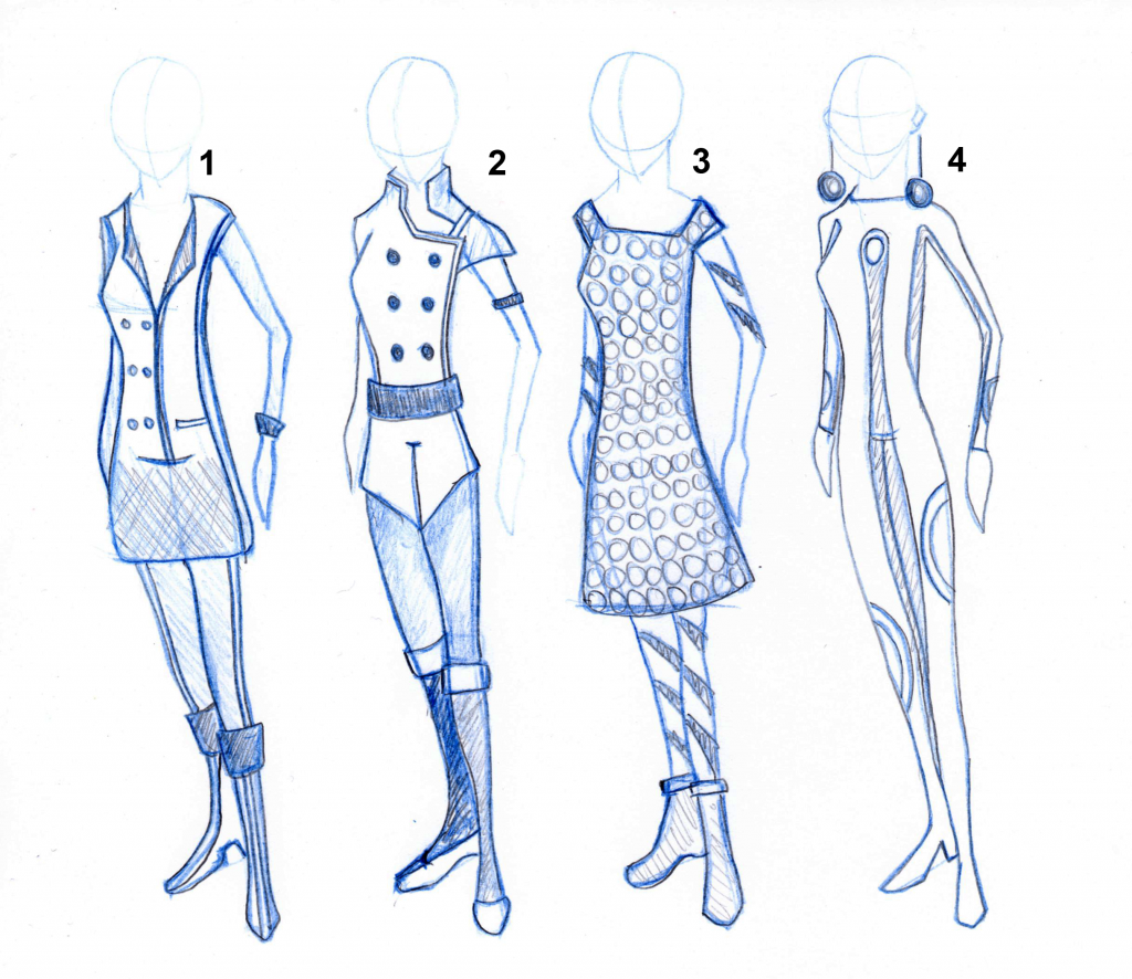
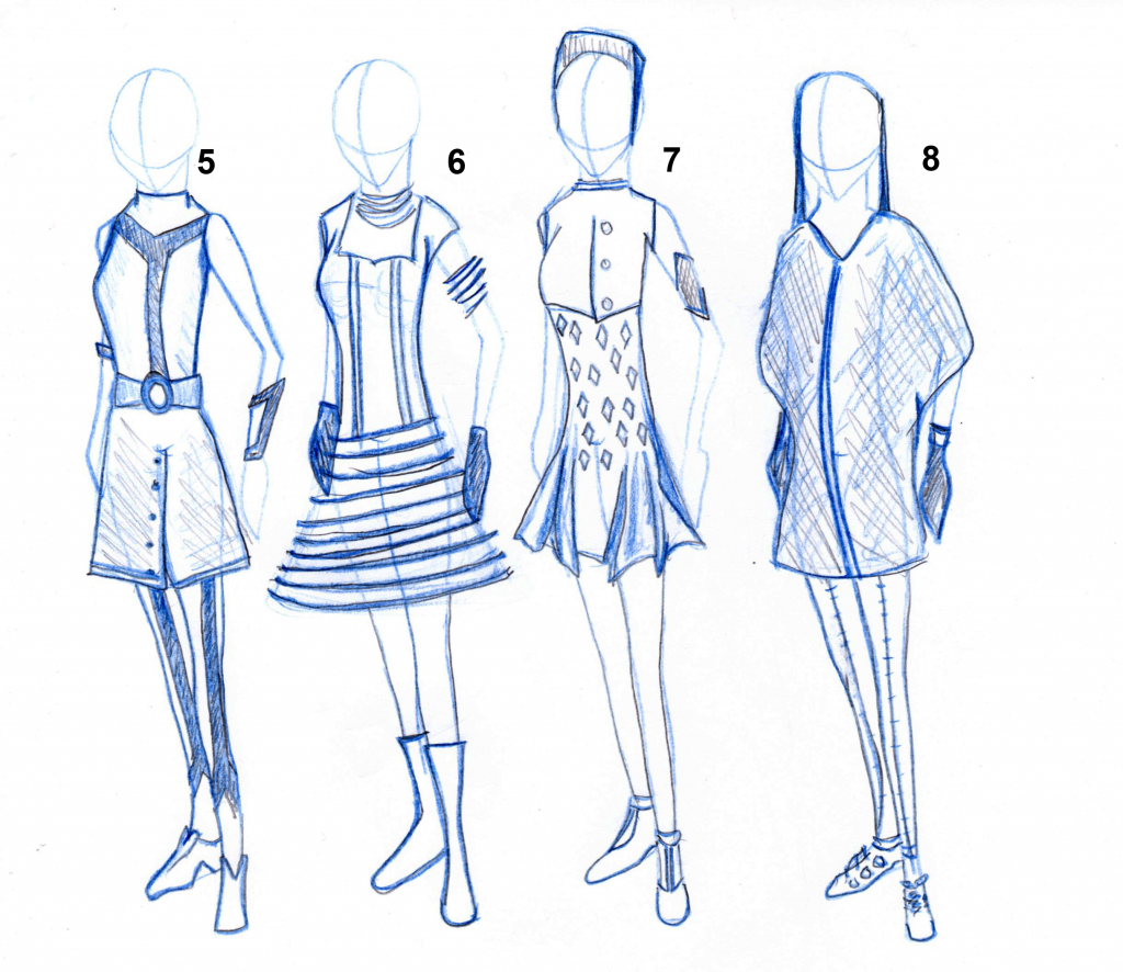
For my first attempts I'm pretty happy with them.
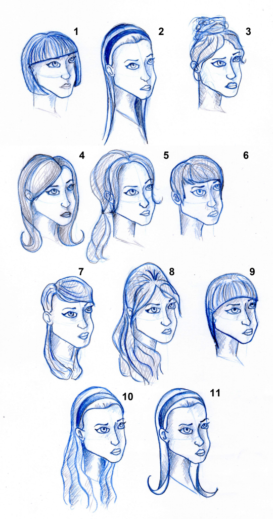
Character Design: New Heroine Hair
I've now updated my heroine to the 1960s theme that I'm going for. I tried a range of hairstyles that I felt would be more suitable but some of theme felt too regular or in the case of #4 made my heroine look too old to be a teenager. The ones that I think were most successful in portraying teenager and 1960s at the same time were #2, #5 and #8. I decided that I was most happy with #2 and could see my heroine complete with outfit like this so I tried a couple of alterations in #10 and #11 with making the hair wavy or flicked out but I think #2 still works best.
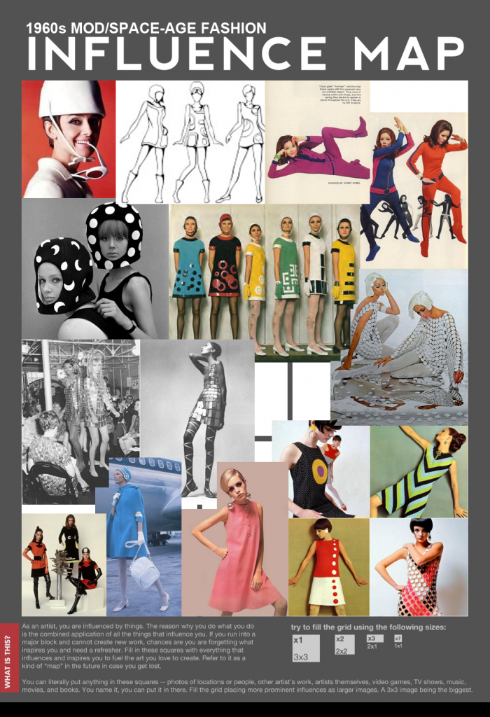
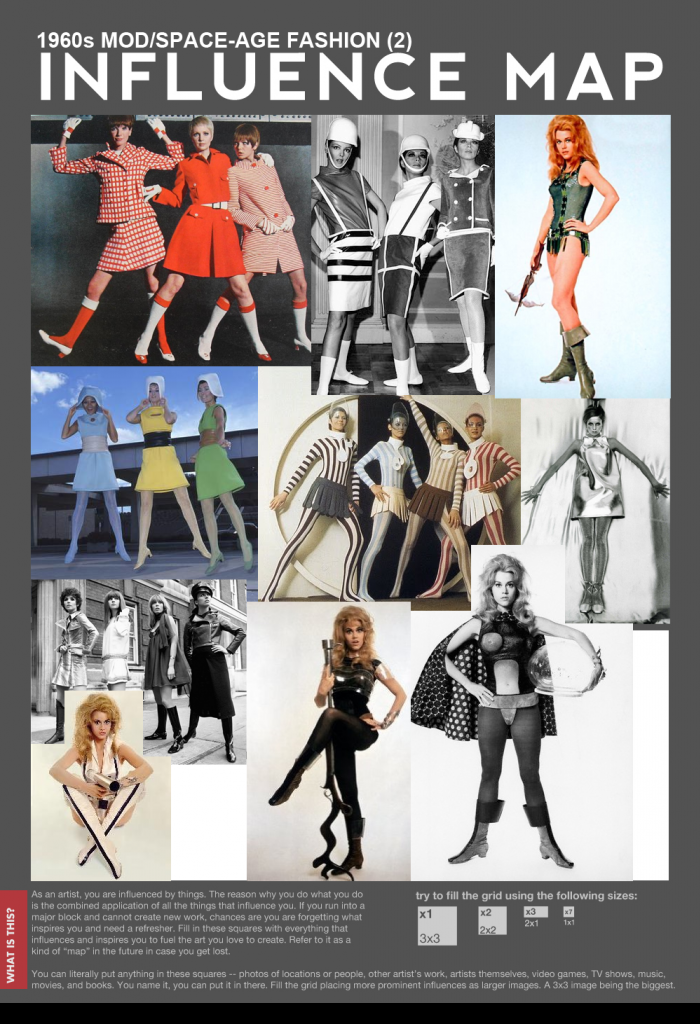
More 1960s Space-Age Fashion
I've looked at some more Space Age fashion in preparation for playing around with my heroine's outfit designs but this time I added Mod styling to my search which came up with even more interesting variations.
Sunday 18 November 2012
1960s Female Hairstyles
I have already done hairstyles for my heroine character and got some good and helpful feedback about them but as I had added an era influence to my project's whole world I need to go back and change the hair up a bit to make it suit this. Nothing wrong with this though, it's all good practice! :)
I have looked at a range of 1960s female hairstyles as I'm not sure as of yet which will end up working best for my character so better to start off with more ideas than less. For some of my influence I specifically looked at the Mod styling of the 60s as there is something very space-age about some of them that could be very appropriate for my character.
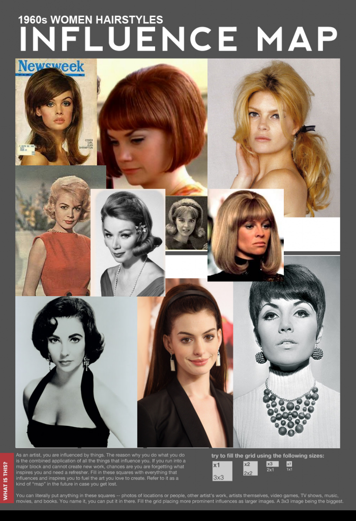
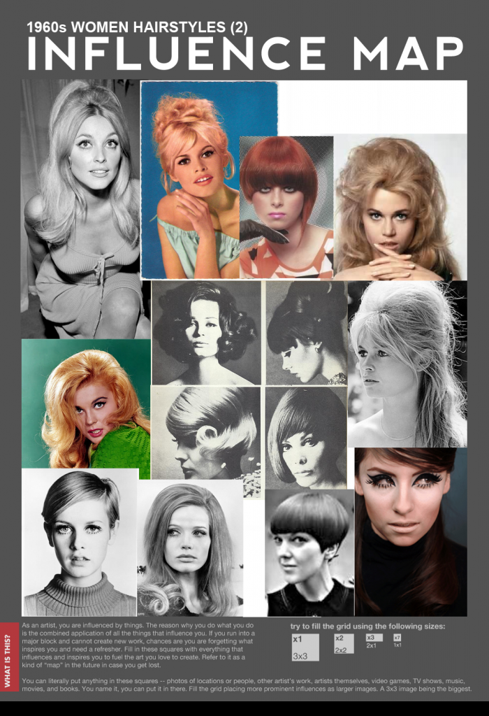
I have looked at a range of 1960s female hairstyles as I'm not sure as of yet which will end up working best for my character so better to start off with more ideas than less. For some of my influence I specifically looked at the Mod styling of the 60s as there is something very space-age about some of them that could be very appropriate for my character.
Character Biography: The Super Intelligent, Wise Owl Robot Sidekick
When it came to thinking up a name for my sidekick I wanted to try and create a clever acronym so I did some research and found out that 'Aves' is a scientific name for 'bird'. I took this to abbreviate with qualities of my sidekick and owls and ended up with astute which means smart, visually enhanced (my sidekick has magnified camera lens eyes) sidekick.
Character Biography- The Super Intelligent, Wise Owl Robot Sidekick
Space-Age Inspired 1960s Fashion
While researching into possible names for my villain I stumbled across a blog called Glamoursplash where I found this great video which looks at elements of 1960s fashion which have been designed with the developing space-age in mind. I think the designs of some of these are stunning while others are quite crazy looking but they all show space influence brilliantly. :)
Saturday 17 November 2012
Character Design: 1950/60s Spy & Space Themed Films
To really get me to start embodying the 1960s in my character design work I have spent a bit of time browsing YouTube for examples of existing examples of film which relate to Secret Agent or Space Opera in some way.
Danger Diabolik (1968) Trailer
Barbarella (1968) Trailer
Space Channel 5 Trailer (1960s Style not made during 60s)
The Jetsons (1962) Intro
Scope 1960s Mouthwash Advert
1960s Spy/Secret Agent Film Posters
Lost In Space (1965) TV Series Trailer
The Ambushers (1967) Trailer
James Bond- You Only Live Twice (1967) Trailer
The Time Travellers (1964) Trailer
Wednesday 14 November 2012
Tuesday 13 November 2012
Character Design: 1960s Inspiration 'The Incredibles'
A talk with Phil yesterday helped me clarify a direction I could go in for my character design. Sticking to an era/time to base my characters in rather than having it open as it was with just the knowledge of what my audience age was should help me feel more confident towards my drawing.
Pixar's 'The Incredibles' took influence from the 1960s so I thought this was a good starting point to see exisitng modern design work based on a time in history.


Pixar's 'The Incredibles' took influence from the 1960s so I thought this was a good starting point to see exisitng modern design work based on a time in history.
Subscribe to:
Posts (Atom)