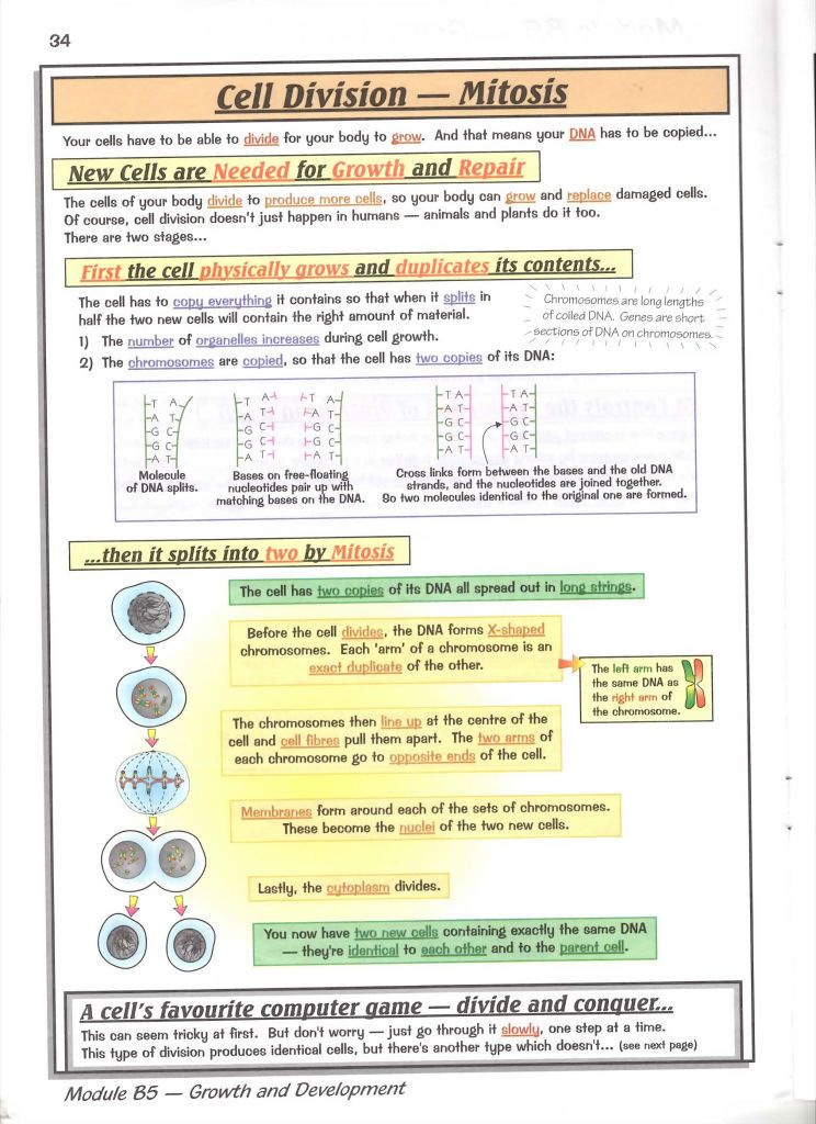
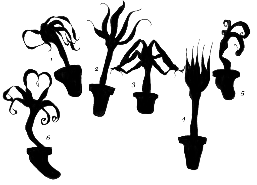
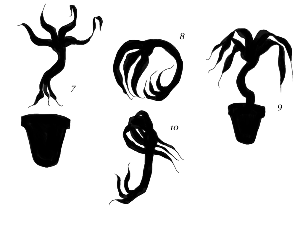
Well it goes to show what three years of not touching anything to do with science does when you can't wrap your head around something you definitely understood then! So some videos I keep watching to try and get myself to understand it. I keep trying to adapt it to my art direction while doing this which probably isn't helping. I need to get the full understanding back before I can do this!
I picked the cell cycle because I think this would work the best with my art direction. Honestly a bit of jazz music and trying to explain cancer together doesn't seem right to me. I think this scenario is more visually appealing for a Saul Bass influenced piece.
cff
Sunday 29 April 2012
Inspiration: Saul Bass
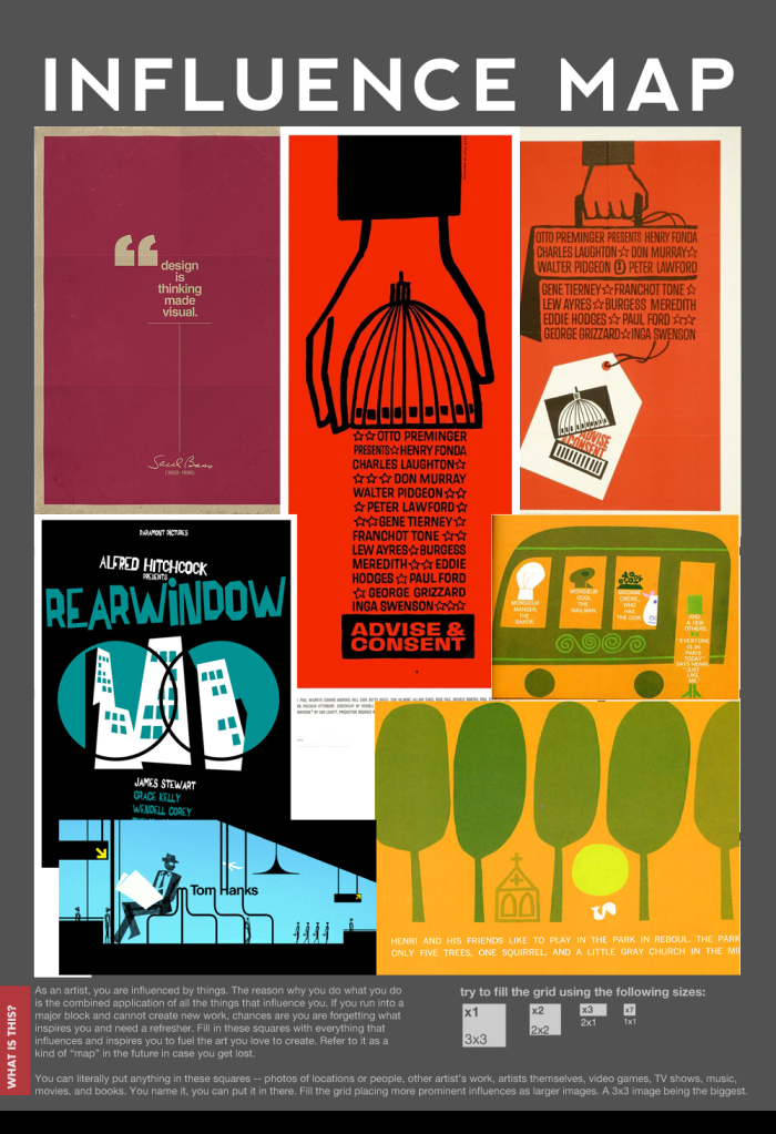
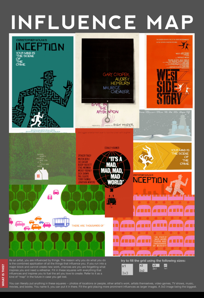
Saul Bass, film director and graphic designer, is most well known for his design of title sequences and film posters.

His work is full of bold use of solid colours and the clever placement of text to either symbolise and form shapes of relevant objects or move along with objects with a fluid motion that also links in.
His most famous work is probably the work he designed for Alfred Hitchcock films 'Psycho' and 'North by Northwest' as well as the many title sequences designed for the films of Stanley Kubrick.
His work may be characteristically his but he still manages to add an element of individuality to each and every piece, showing how clever his mind was even with the most simple of his designs.
Saul Bass has been a major influence and figure in the art world, graphic design and film making, that it is no wonder that many contemporary films and artists have paid homage to him including ones such as Steven Spielberg's 'Catch Me if you Can', Pixar's 'Monsters Inc.' and television series 'Mad Men'.
Bass' most famous saying is...
'Design is thinking made visual.'
'Design is thinking made visual.'
I think it is important that I adopt this saying for my own work ethic in progress of my animation because this art direction is so simple yet so effective and so if I try and over complicate things it will not work as successfully. I need to be clever with the placing of things such as the words to describe what is happening. Even if these turn out to become the forms of some of the science components in my animation.
I have to really play with the visual element with this as this could really make people understand the science topic better. I know that I myself struggled with science unless I could see it so the simplified textbooks and revision guides and the diagrams my teachers drew for us we're great for me. This style is perfect for this, I just need to really make it work!
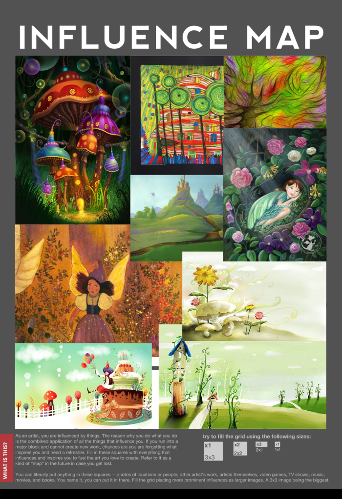
Some influence maps of past Saul Bass work and contemporary Bass inspired pieces.
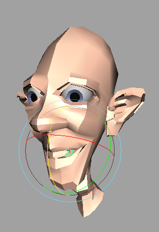
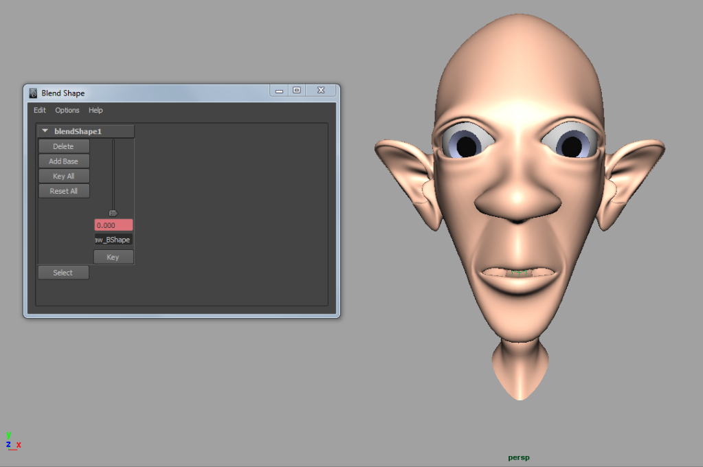
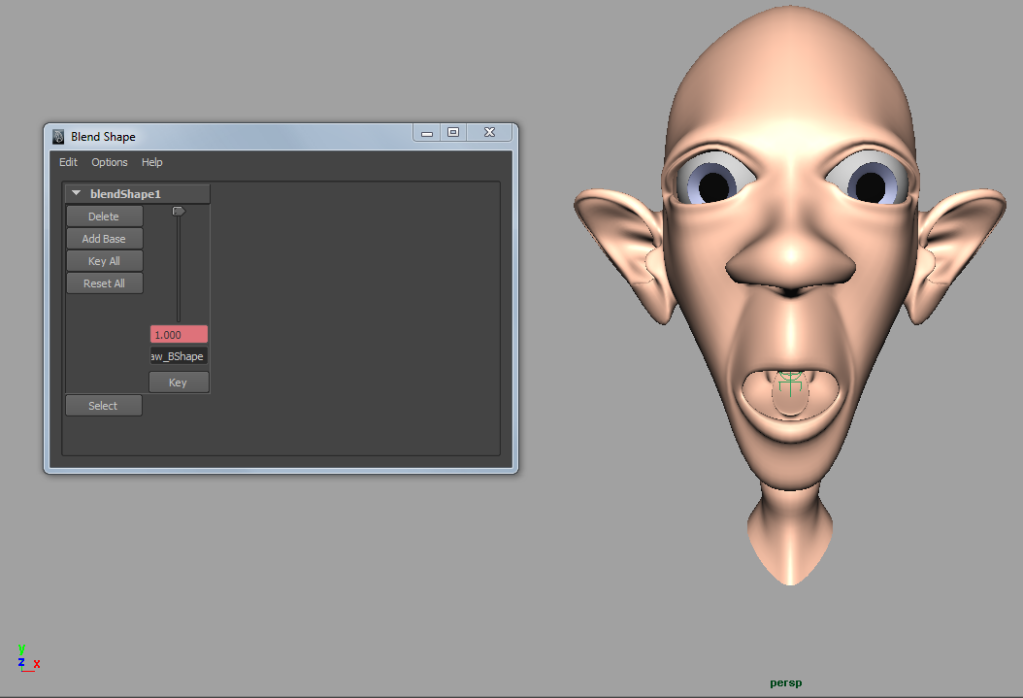
Skinning: Intro to Skinning
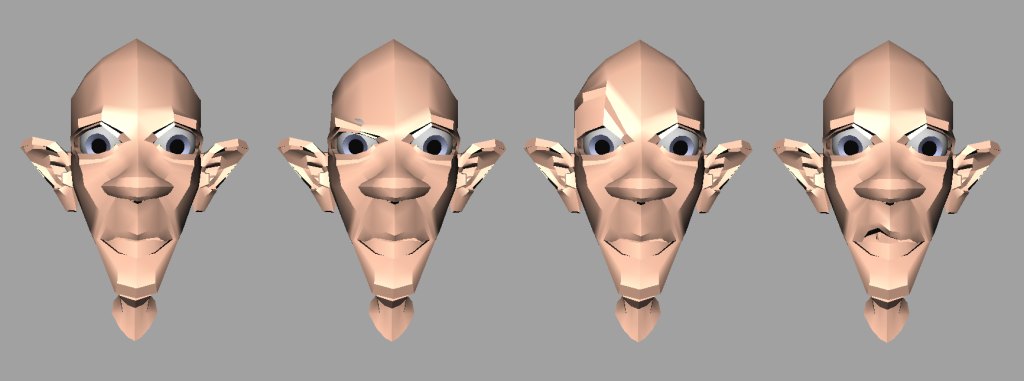
My first ever skinning is complete! Took a while and had some problems but managed to sort them out myself which makes me even more pleased. :)
Friday 27 April 2012
1950/60s style title sequences inspiration
After some suggestions and videos from Phil I have been researching some more videos to get a stronger sense of on the lines I could achieve. Some of these are not necessarily from the actual 1950s/60s but they have a similar style which I thought was worth looking at to have more options.
Apologies in advance for getting carried away with video embedding, this is just a good way for me to find what I'm looking for when I recap :)
Charade
Kiss Kiss Bang Bang
Cowboy
Around the world in eighty days- love this one!
The Facts of Life
This one is a lot more contemporary and isn't for the original film but it's still really interesting!
Strangers on a Train- This one has been really helpful in seeing how the camera can rotate to add a 3D sense about the world rather than the flat static camera.
The Return of the Pink Panther
Casino Royale
Hustle
Mad Men
Mad Men again
Thursday 26 April 2012
@ Phil
Hi Phil I'm just wondering if you could take a look at my other ideas for me please. I'm not sure where to narrow down there are just too many! I just want to know which ideas may work better so that I can get cracking and catch up with work easier. Thanks!
Unit 6: Ideas 4 & 5
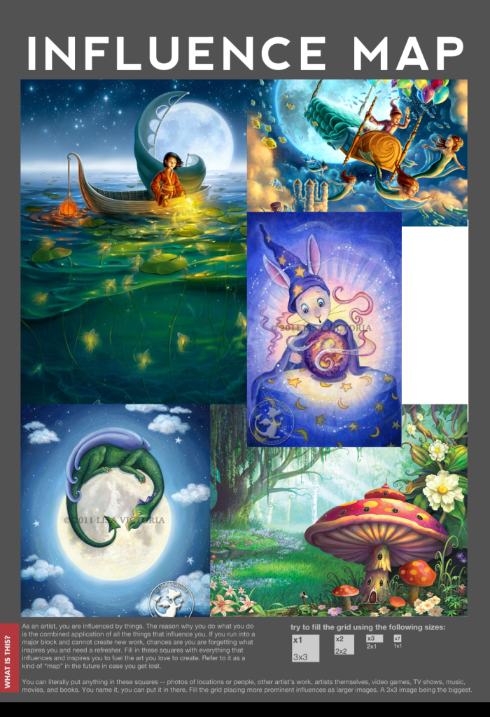
My 4th idea comes from another love of mine which is fantasy and fantasy art. But I didn't just want to look at fantasy art in general, that's way too broad. It was elements of child fantasy art that really interested me but don't worry I would keep it as far away from Potterland as possible... well I would hope my brain would let me!

However, I also really like the bottom of the image on the top left of influence map 2 (underwater). To me it has a science sense with the fantasy.
When I found some of the images below in my influence map they reminded me of the original Charlie and the Chocolate Factory film and I thought this was nice to maybe have the aesthetic of plastic like sweets like the gummy bears Verruca Salt pretty much uses as a punching bag. This could also have a nice squash and stretch effect which would be useful for the division of cells. I also like the translucency factor which to me would keep the science touch.

However, I also really like the bottom of the image on the top left of influence map 2 (underwater). To me it has a science sense with the fantasy.
Wednesday 25 April 2012
Unit 6: Ideas 2 & 3
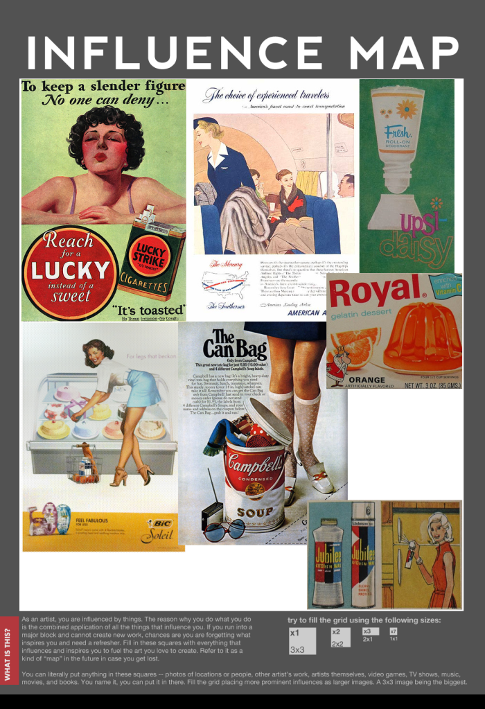
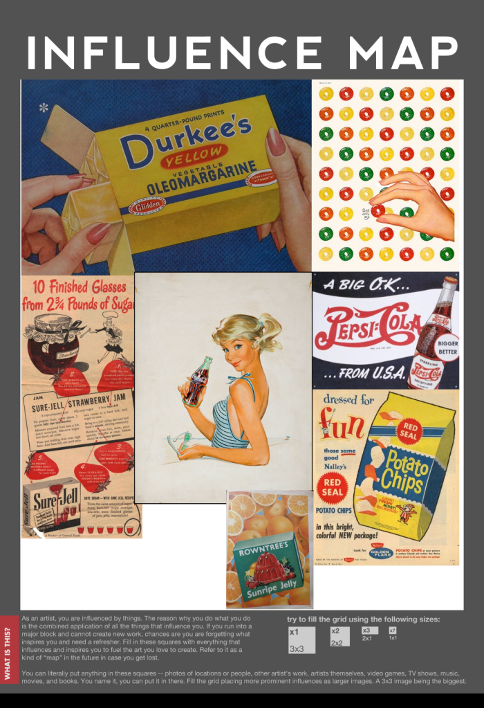
My next ideas come from one of my own loves and that's anything and everything vintage! I especially love the 1950s and 60s but these ideas focus on a 1960s influence. This is a big thing right now with the styles of these eras coming back and films/TV shows focusing on these times, one of which I can't not mention... Mad Men!
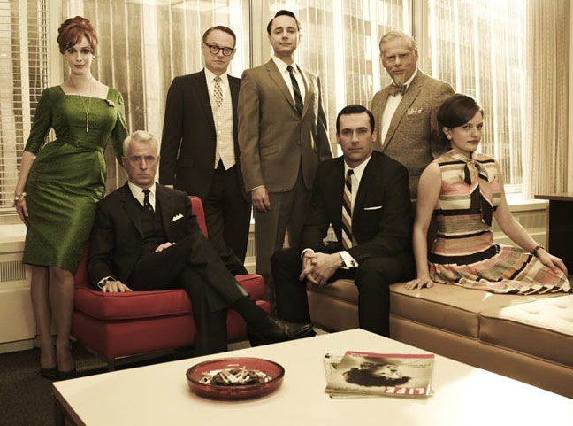

The 2nd idea is creating the cell division world in a 1960s advertising style with all the characteristic descriptions and classic graphics, colours and pop art feel. An example of 1960s adverts like this is below.
Unit 6: Idea 1
When we first had the briefing for unit 6 an idea struck to mind straight away with an art direction I could perhaps use. I think it was the mention of barriers stopping the division of cells after they have done their job but the cancer cells ignoring these barriers that got this idea popping into my head.
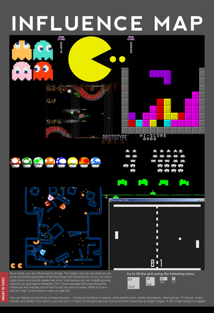
My first idea is giving the story of normal cell division being interrupted by the non-stop cancer cell division a retro gaming feel with the very vivid and classic arcade colouring and stylisation. It was probably the pac-man games that started off this idea in my head of this evil cancer cell munching through these barriers.
Pong also inspired me because of the bouncing action that surrounds the gameplay. Maybe the cells that have divided enough could bounce off the barriers because they've been stopped from going through.
This art direction would target teenagers because of the resurgence of retro and even children because of the bright colours.
Unit 6: Commission

Well I can finally start getting up to date with the new unit, am looking pretty forward to it and the freedom even though that can become really scary!
Being busy with past work over the beginning of this week has allowed me to really think about what I could do for this project. Some ideas I've had longer than others but the more the merrier really as I can then start eliminating them based on what could work best. I'll be posting these ideas in separate posts next.
The Giddy Pot Plant Animation (without titles)
Well it's finally complete (titles in next post) but I think it was really worth it because I'm really happy with it!
Sunday 22 April 2012
Saturday 21 April 2012
Animation Lessons- Corrections
Here are my corrections for Meg's Lessons. Two of them are just little tweaks but the chair one I did again completely as it just didn't work well.
Made the ball stay on the ground for 1/2 more frames to stop it lifting up too quickly for the bounce.
Reduced the squash of the ball when it lands on the ground.
Made the ball stay on the ground for 1/2 more frames to stop it lifting up too quickly for the bounce.
Reduced the squash of the ball when it lands on the ground.
Unit 5: Submission Disc Artwork
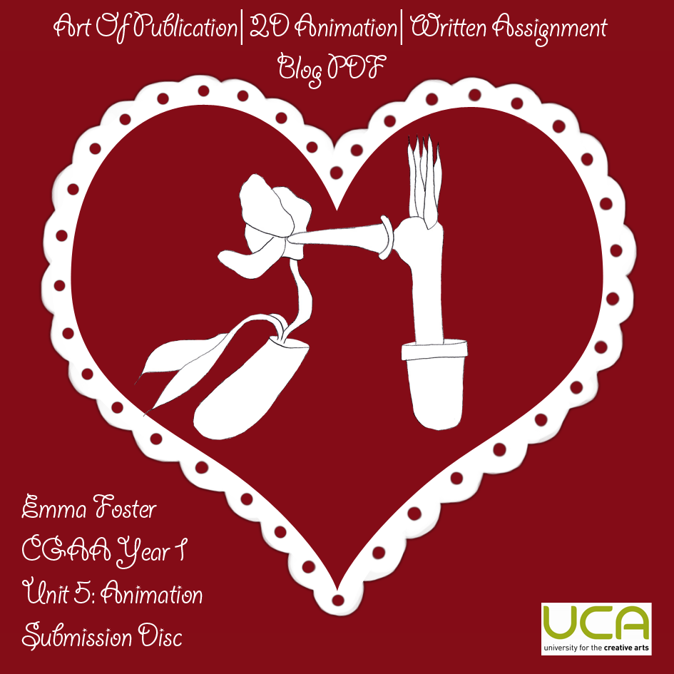
Here is the artwork for my DVD and case. I wanted it to link in with my 'Art of' so I took the two main art pieces featured in the layout and combined them. I created this scalloped heart in photoshop to use as the introduction to my work as it is so characteristic to see the heart at the end of a romantic scene of a cartoon and my animation follows suit. I also thought the frilly scallops add a silly element to the design and link in to the giddiness of my animation.
CD Case Artwork


CD Case Artwork

Friday 20 April 2012
The 'Art of' The Giddy Pot Plant
For some reason the front and last pages are a bit fuzzy in places but I think this is due to Scribd as it isn't like that in my Art of when it is a normal PDF not on Scribd.
The Art of 'the Giddy Pot Plant'
Thursday 19 April 2012
Lotte Reiniger inspired animation ending cut-out prep
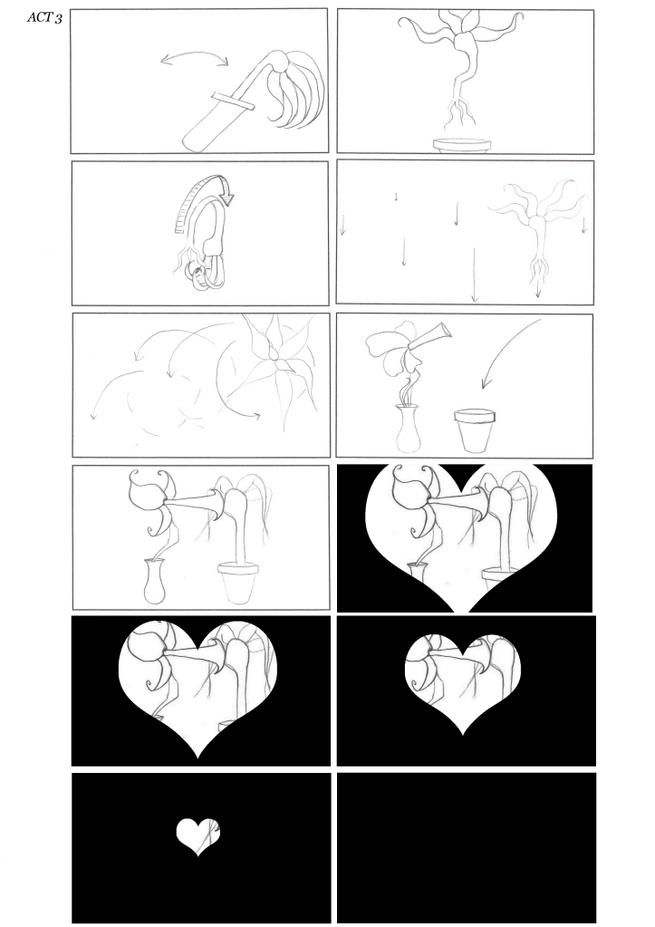
At the end of my animation the classic heart closes in on the romantic scene. I could have easily done this on photoshop or similar but what would be the point of that when this is a hand drawn animation!
I then instead could have drawn the heart shape gradually coming in on each frame but then I thought about including another hand/2D animation technique that we have learned about and which we automatically are reminded of Reiniger's work... That is the shadow puppetlike silhouette cut outs.
I took an existing frame from the first kiss scene to prep these cut outs for my finale. This has not only helped me figure out how many cut outs I need but exactly where I need to draw my two characters because in this frame they turned out to not be where I want them at the end.
Wednesday 11 April 2012
Webster's Walk Cycle
I have finally got to finishing off Webster's walk cycle. His strut is a key part of his story in trying to impress Delilah and so I really wanted this behaviour to come over through his walk. I think to himself he looks cool but to me he looks pretty ridiculous!
Monday 9 April 2012
@Phil
Hi Phil! I'm just wondering if we're allowed to use sounds such as a sigh to aid the storytelling even though these are more human sounds. Thanks :)
Sunday 8 April 2012
First 10 Seconds of Animation
This first 10 seconds has taken me a while but I'm really happy that I've battled through it and didn't give up on trying to get the animated camera work I wanted, and now I have a better understanding of animating the camera and have learnt on my way some ways I can check that the animation works without doing it perfectly and scanning it in first time. Now I should be quicker!
I don't however have any idea why there is a border around the sides of my animation when I am using the same frame I have been using throughout this unit :(
Animation Breakdown & Animatic
After completing my final storyboard I put together a table figuring out how long each part of my storyboard should be on screen for and then how many frames this will consist me drawing. Some storyboard numbers are halfs because they do not feature in the drawn storyboard because they were not as important but are needed to make the animation flow.
I then created an animatic with this storyboard and added in some sounds/music that I think I will be using to help show my direction for the animation. It's a bit shorter than 1 minute but that's because it doesn't have the half numbers of the storyboard.
I then created an animatic with this storyboard and added in some sounds/music that I think I will be using to help show my direction for the animation. It's a bit shorter than 1 minute but that's because it doesn't have the half numbers of the storyboard.
Unit 5: Final Storyboard
The next couple of posts are quite late seen as I did them a while ago but seen as I've been hunched over my lightbox battling through my animating I forgot to put them up until I checked my list!
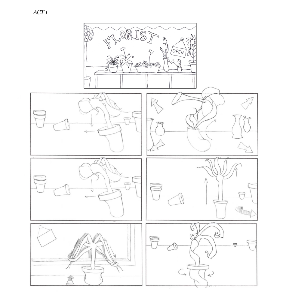
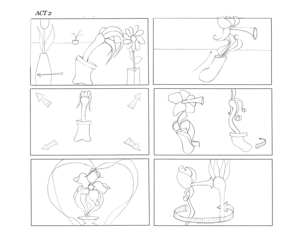
Here is my presentation storyboard which I have also used to produce an animatic. I hope it's clear and shows how the camera and characters move!
Here is my presentation storyboard which I have also used to produce an animatic. I hope it's clear and shows how the camera and characters move!
Wednesday 4 April 2012
Giddy Line 10 Second Animation & Titles
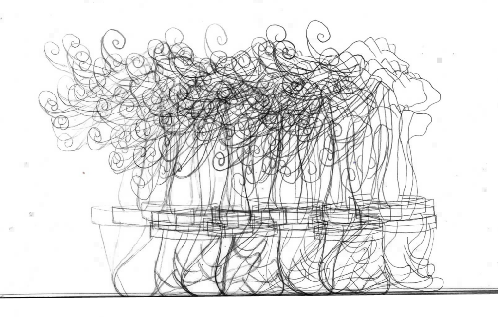
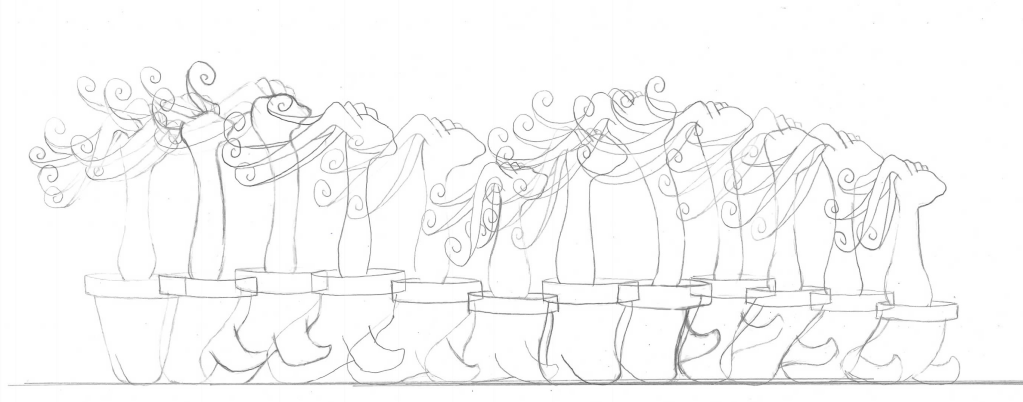
Here is my finished line animation for the final animation last Friday. This has been really helpful in preparation for my final animation in that figuring out how many frames movement in betweens cover to get the right feel such as being dizzy. I started with the line having very few frames for this emotion and it didn't look dizzy, after adding a few in it looks a lot better. I tried to have my line become part of my titles at the end with it taking the place of the 'I'.
Webster developed character sheets
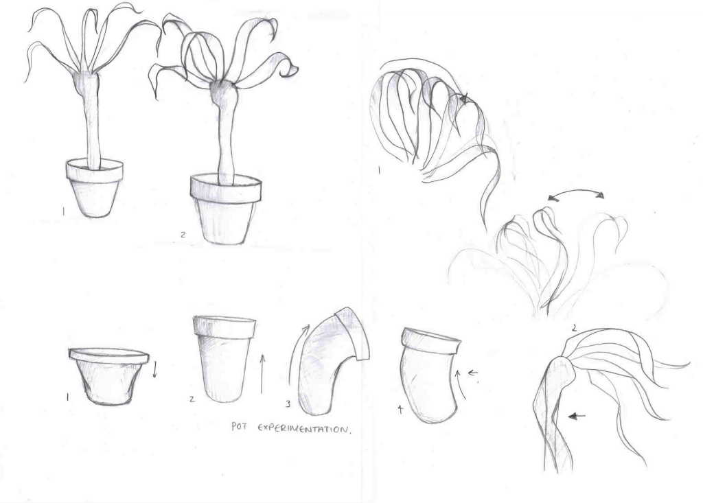
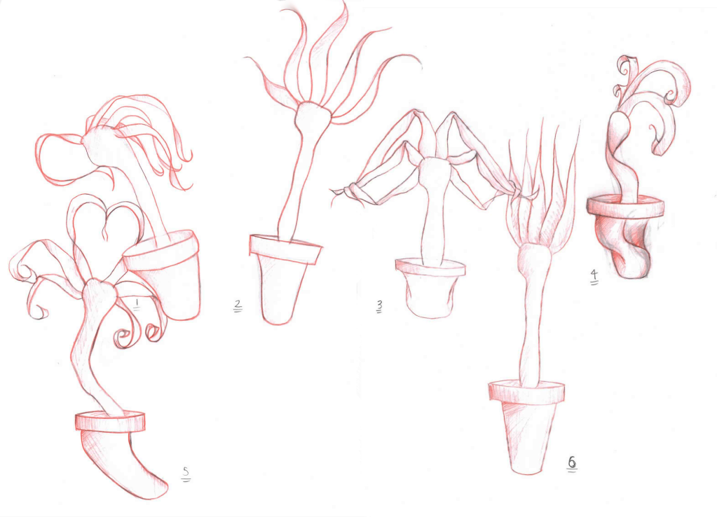
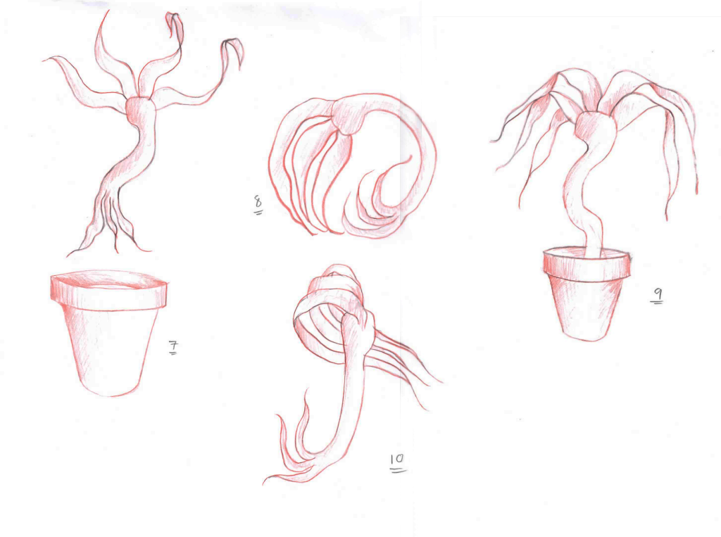
Right I think my characters are finally sorted enough that I can process quite happily into my animation, just got to redo my storyboard beforehand! There are a couple of tweaks I think I will do such as narrowing the trunk a little but that can all be applied during animating. Just like for my daffodil I have created a character sheet looking at how my yucca plant can stretch, squash, bend.. you name it and then a couple of sheets looking at relevant actions, finally changing them to silhouettes to check that these actions are effectively conveyed.
Webster developed
Tuesday 3 April 2012
Webster Experimentation in Stop-Motion
I took a couple of my plasticine poses and made some shot animations of them in Premiere Pro to help me test them out.
This one I was testing out Webster's trying to impress strut movement of his leaves. I have learnt that to slow it down in my real animation I will need a lot of frames for it as this one is too fast and that his head should sort of turn from left to right to have a front/back sway of the leaves but also a left/right sway. I think this would express his want to look nice for Delilah. Displaying his leaves as such but also be more consistent of a walk cycle (our heads move to either side with each step) and a bit more nerdy.
Doing this experiment has really helped me visualise how I can have Webster spin during his celebratory/giddy dance.
Monday 2 April 2012
Webster the Yucca Plant Experimentation
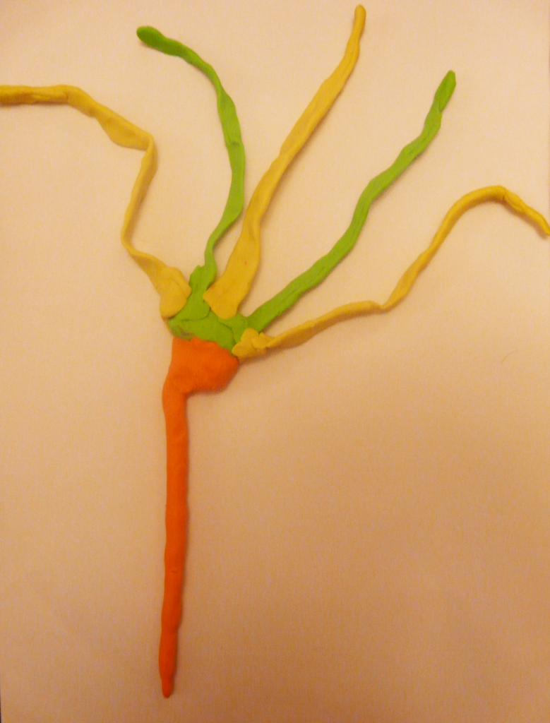
More plasticine experimentation, but this time with the plant that will become giddy. I thought this would be a useful technique to help me figure out how this plant will move to create each emotion so between each photograph I would have the model reenact the emotion. Some of these definitely need more exaggeration but like my daffodil I will apply this in the drawings I can now create from these models.
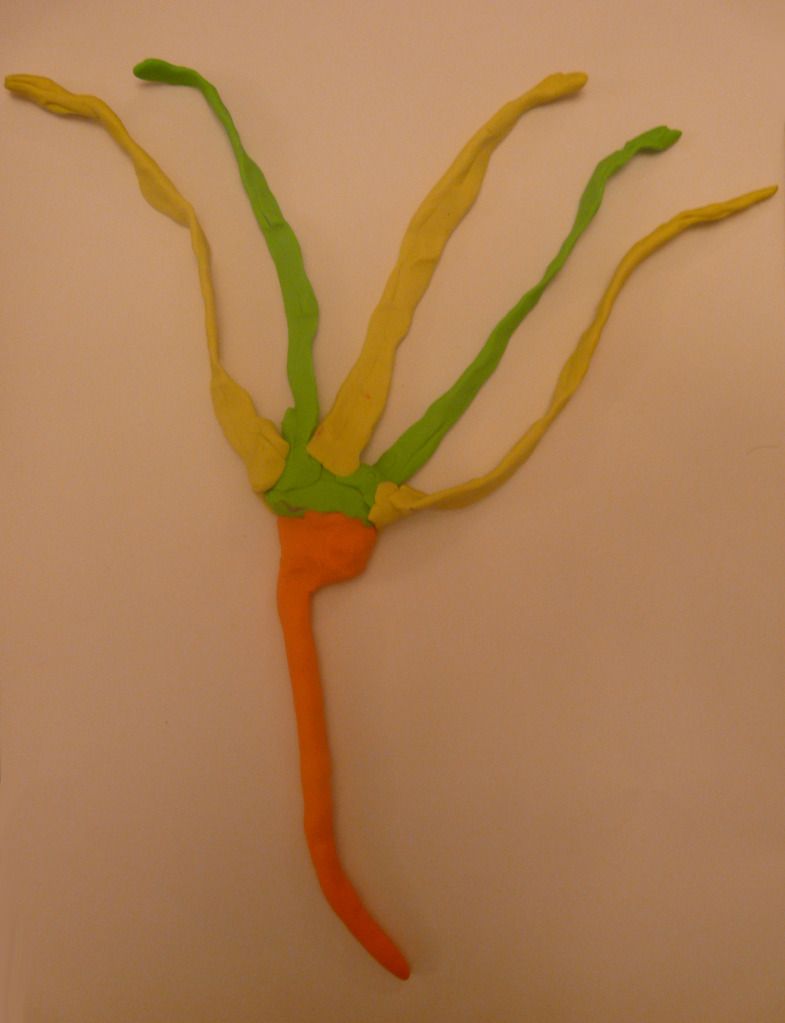
Regular Webster, I did like this but I thought this could go further and so I ended up with the result below.
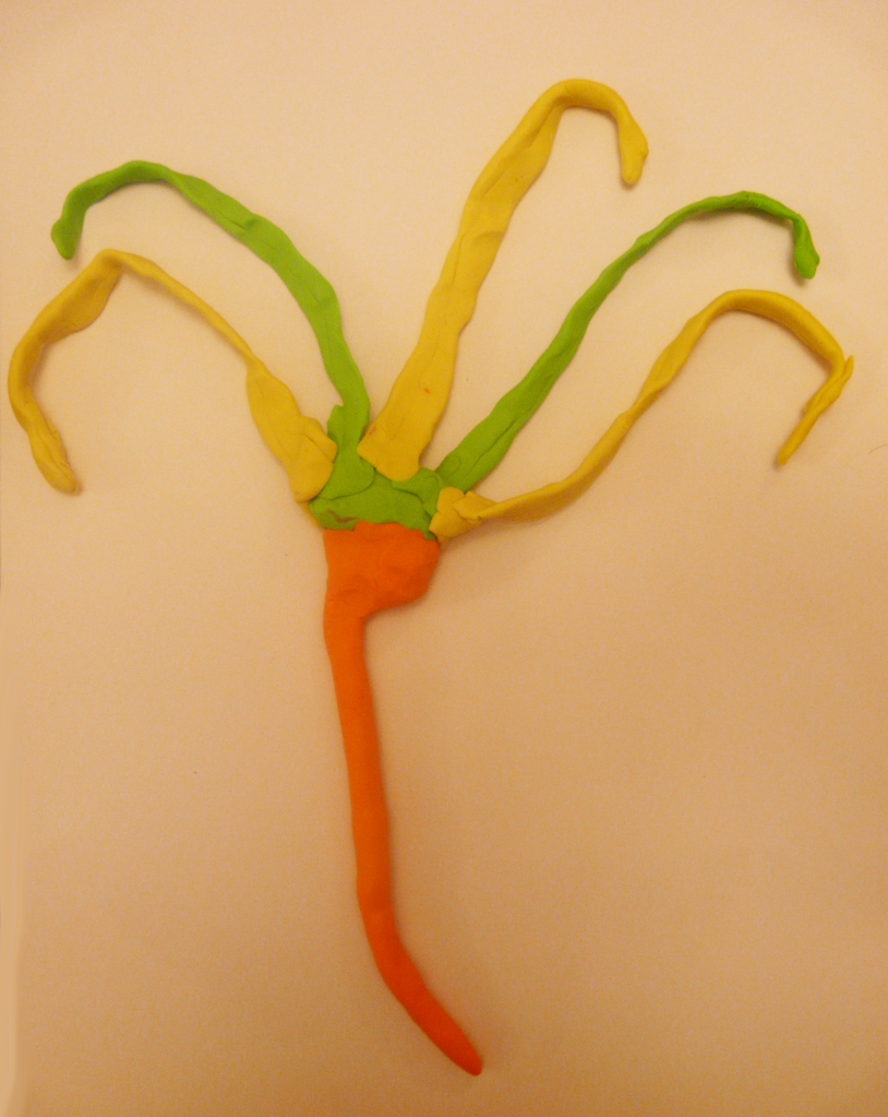
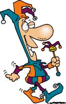
When I manipulated the model into this it struck me that it sort of looks like a jester! After some googling these pictures particularly interested me and I think I could use them to help me with Webster's characterisation.

I like how the hat of this jester flops down, maybe I could apply this to Webster's leaves when I thicken them up in my drawings.
I liked this one too because of the walk, I want Webster to strut over to Delilah but I want him to look a bit silly doing it and the push out of the torso and the jester's bells jingling could be applied to Webster's movement. His trunk puffed out and his leaves swinging in the air like the bells.
Webster struck with an idea. The stretching of the trunk and the leaves rising a bit is meant to simulate this but I think all in all this movement would be easier to show from actually making it into frames in my animation
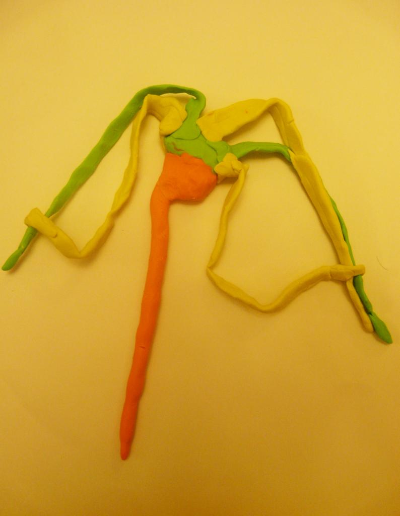
Webster gussying up/ combing leaves.
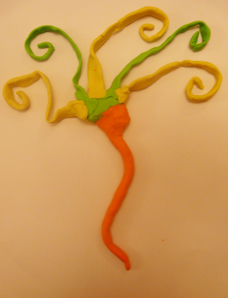
Checking himself out. This one results from the combing. It doesn't quite work out for him but the curls simulate his effort. A bit like Tom in Tom and Jerry with his straightening of his whiskers which actually looks pretty silly! The actually checking it out I feel requires real movement
though.
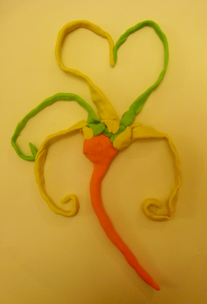
Webster trying to woo Delilah. He still has the curls in his leaves showing his trying to impress her and his 'chest' is puffed out in an attempt to look tougher/stronger.
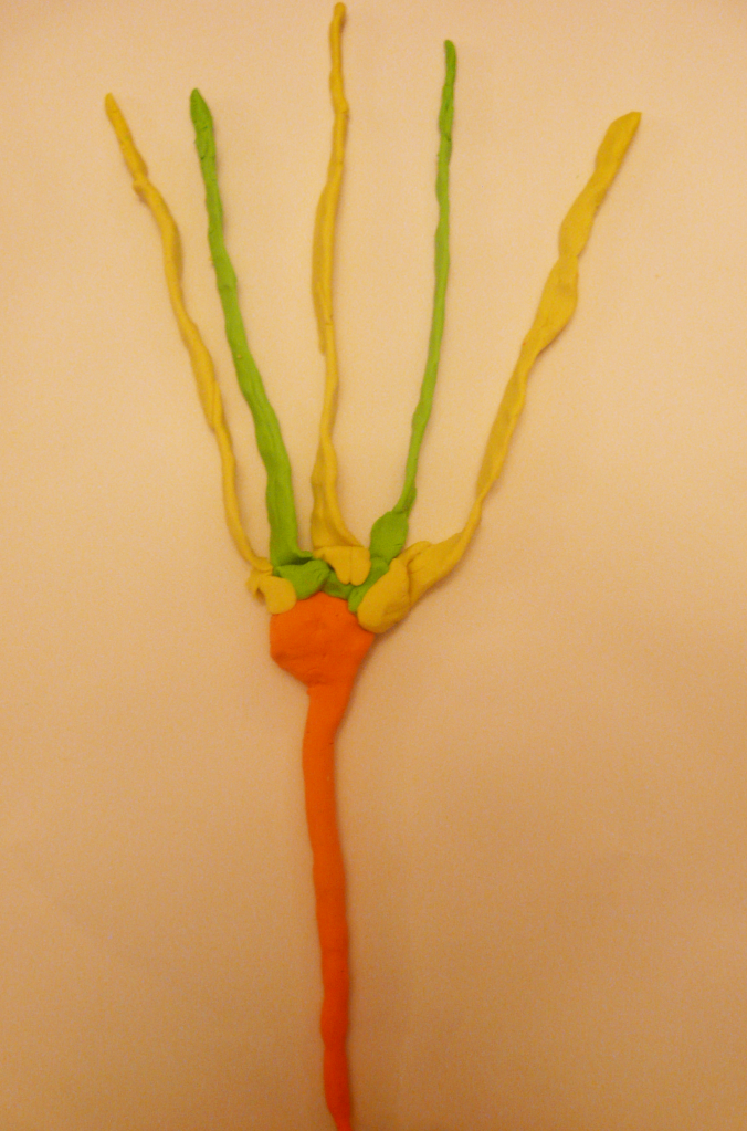
Stunned/shocked after kiss.
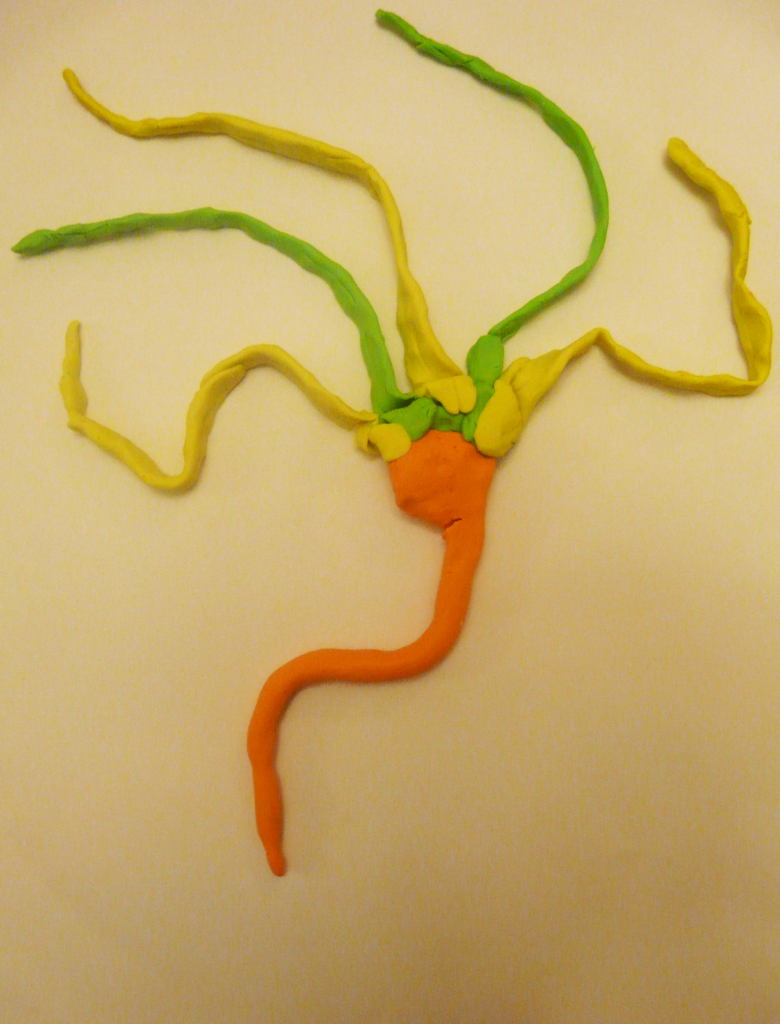
Leap/jump of celebration
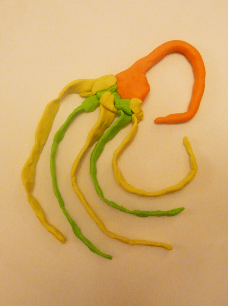
Flipping
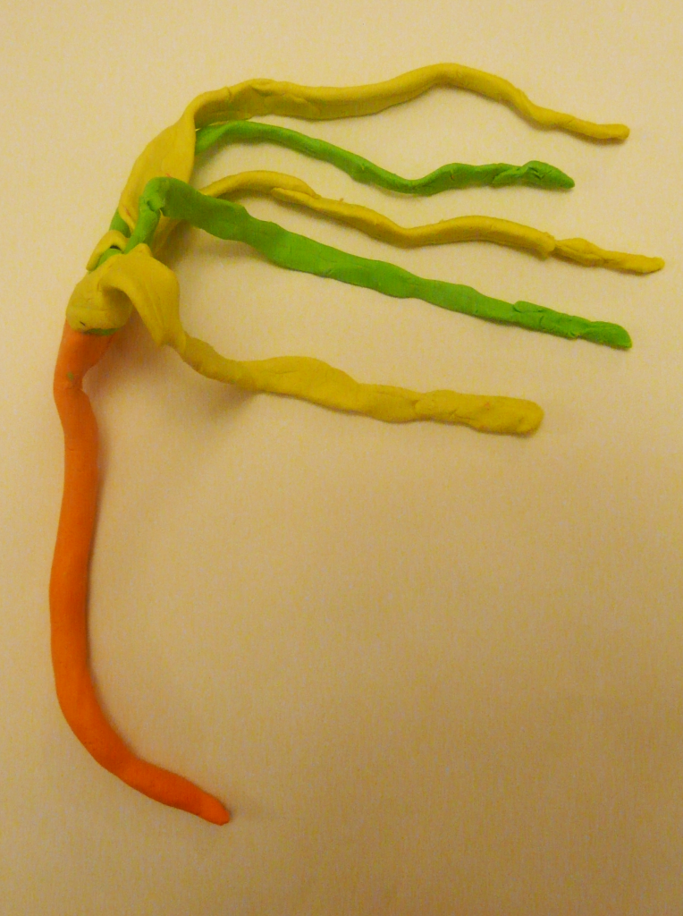
Skipping. Again this needs actual movement but the leaves in the whoosh of air is there.
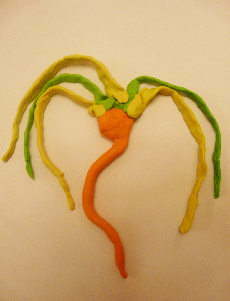
Satisfied/content during the second kiss.

Regular Webster, I did like this but I thought this could go further and so I ended up with the result below.

When I manipulated the model into this it struck me that it sort of looks like a jester! After some googling these pictures particularly interested me and I think I could use them to help me with Webster's characterisation.

I like how the hat of this jester flops down, maybe I could apply this to Webster's leaves when I thicken them up in my drawings.

I liked this one too because of the walk, I want Webster to strut over to Delilah but I want him to look a bit silly doing it and the push out of the torso and the jester's bells jingling could be applied to Webster's movement. His trunk puffed out and his leaves swinging in the air like the bells.

Webster struck with an idea. The stretching of the trunk and the leaves rising a bit is meant to simulate this but I think all in all this movement would be easier to show from actually making it into frames in my animation

Webster gussying up/ combing leaves.

Checking himself out. This one results from the combing. It doesn't quite work out for him but the curls simulate his effort. A bit like Tom in Tom and Jerry with his straightening of his whiskers which actually looks pretty silly! The actually checking it out I feel requires real movement
though.

Webster trying to woo Delilah. He still has the curls in his leaves showing his trying to impress her and his 'chest' is puffed out in an attempt to look tougher/stronger.

Stunned/shocked after kiss.

Leap/jump of celebration

Flipping

Skipping. Again this needs actual movement but the leaves in the whoosh of air is there.

Satisfied/content during the second kiss.
Sunday 1 April 2012
Subscribe to:
Posts (Atom)

